Barry Quinn
The Challenge of Change
2020 / Graduating Year / VisComm 09/01/2021
Barry Quinn
2020 / Graduating Year / VisComm 09/01/2021
A pictorial narrative of transition in the Mercier Catholic Record Club collection
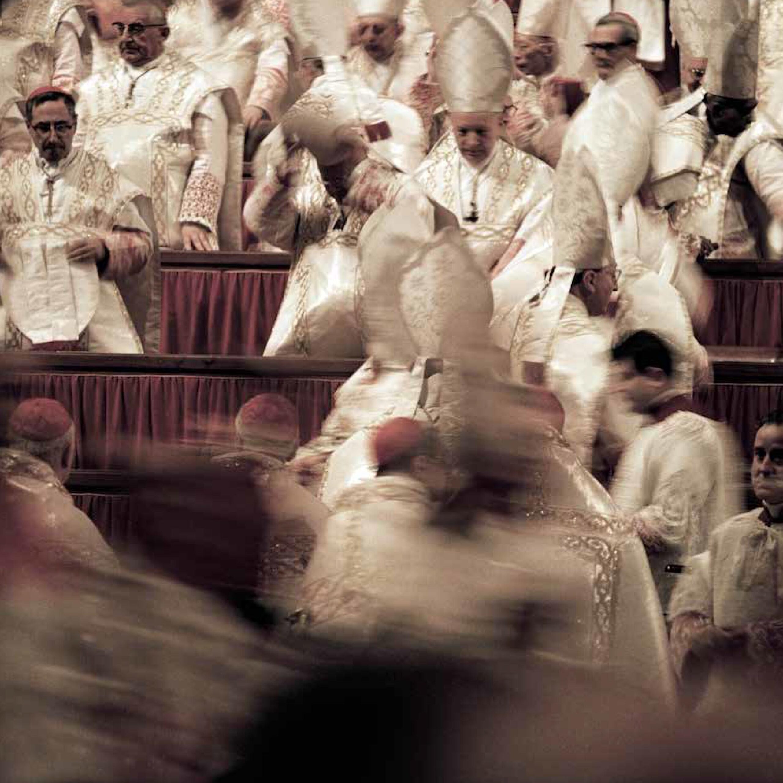
The design industry of mid-20th century Ireland witnessed a series of decisive events that re-framed its role and revised its practice within all aspects of Irish culture. This period saw recognition of a disconnect from a modernising world that was to be addressed within several interconnected sectors of society. Particularly significant of these to the world of graphic design was the influx of Dutch designers to the country, beginning with the arrival of Guus Melai in 1951. To advance Ireland’s tourism development, the Sun Advertising agency looked to the expertise of Holland’s tourist industry[1]. This was part of a continued campaign following an assessed schism between art and industry that led to William H. Walsh’s role within Coras Trachtala and the influential 1962 Scandinavian Report. These events led to significant reforms throughout the design sector as Ireland sought to reviatlise its creative industries to meet the standards of their European and American counterparts[2]. Meanwhile, the Catholic church sought its own reforms, as the Second Vatican Council recognised the need to reassess the church’s relationship with a modernising world.
It is in the context of the religious reformations that this essay will look at the pictorial depictions of transition, between tradition and modernity, as can be seen in the work of Dutch designer Cor Klaasen. Focusing on a selection of his designs created for the Mercier Catholic Record Club, I will explore Klaasen’s use of theme, composition and form in showcasing a challenge to traditional symbology and subject with contemporary design aesthetics. This is in the backdrop of a post-Vatican II Ireland and a church in the process of reconciliation with its representation. Klaasen’s work can be seen as an extension of the larger Dutch design group, in offering a unique perspective of Irish culture at the time, as part of a continued period of development of the Irish visual language. The combination of circumstance provided for an opportunity for these illustrations to explore the complex period through an unconventional medium. The series of covers presents a modernist depiction of the internal shifts that were happening within the Irish Catholic church, while also exploring how one visually represents transitions in tradition and culture in the face of a modernising world.
The Second Vatican Council signaled a significant shift in how the church addressed the contemporary social and technological changes of the modern age. This was in many ways counter to the sentiment of the Irish population, the popularity of the church continually growing following the establishment of the Irish Free State. Sile de Cleir attributes the strength of opinion in the religion partially to active efforts of engagement in public media and harmonizing efforts of popular religious media throughout the early and mid 20th century, challenging a perceived notion of an official and unofficial religion[3]. Nonetheless, with the Church’s call for reform came a need to revitalize its visual representation, and an opportunity was opened for artists and designers to explore and engage with modernist ideals within a powerful platform. The period saw a shift in design and devotional imagery as the church sought to re-imagine this new vision. Printed media such as the Messenger of the Sacred Heart began printing in colour and increasing its numbers of illustrations[4] while the architecture of religious buildings was given greater freedoms to express modernist forms and principles[5]. For a country with a predominantly Catholic readership, the reforms had a significant impact on the inner workings of the Irish publication industry.
Launched in 1944, by the 1960s Mercier Press were among the largest publishers in the country. From their onset, they were adventurous with their publication choices, largely down to the enterprising spirit of its founder, John Feehan, producing challenging interpretations of religious themed publications and content that broached controversial subjects[6]. However, a shift in church doctrinal attitudes were hugely disruptive to the publisher’s largely Catholic catalogue. The Second Vatican Council created a situation that left much of the Catholic publication industry with a significant amount of literature that was now obsolete. John Spillane recounts that one of his first jobs in starting with Mercier was to dispose of thousands of their stock; “Textbooks which Mercier had issued and re-issued for years all became useless literally overnight.”[7]. Change, in this situation, was not only expected, but necessary for economic survival.
“Textbooks which Mercier had issued and re-issued for years all became useless literally overnight.”
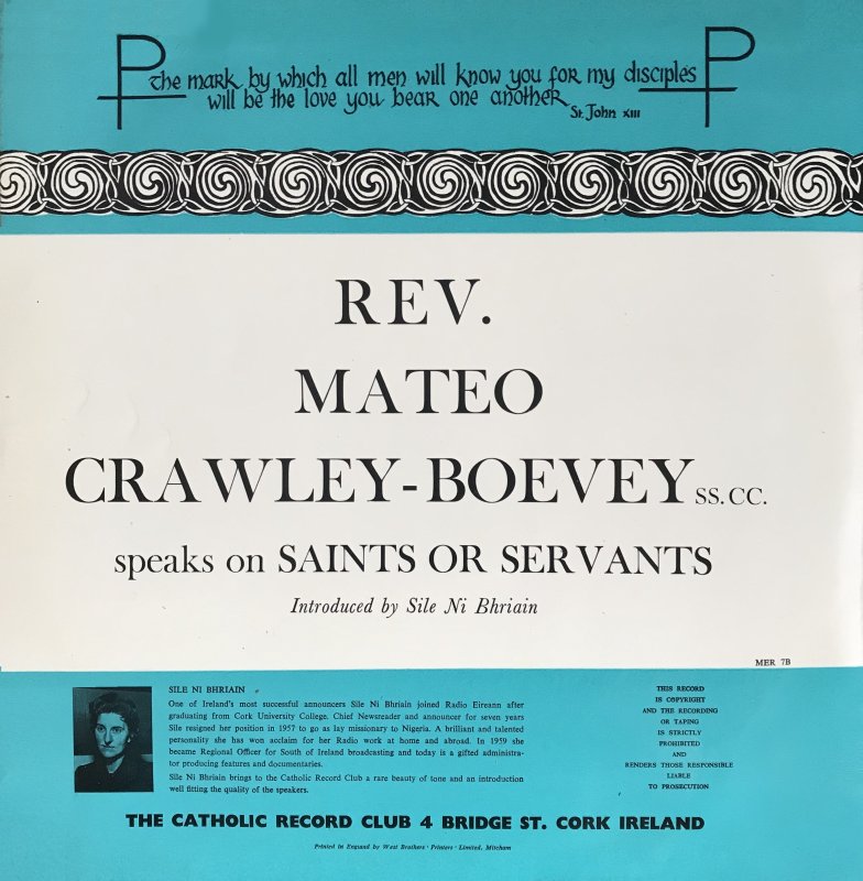
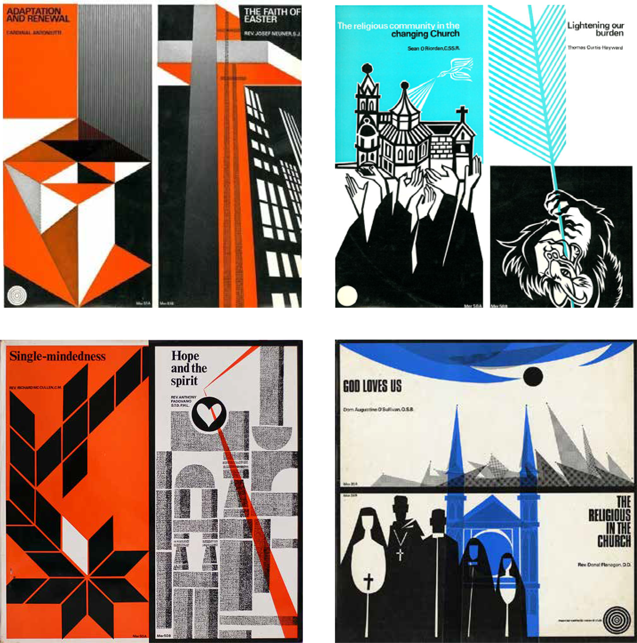
It was within this context that Cor Klaasen’s series for the Mercier Catholic Record Club is produced. The production of these items reflects director John Freehan’s willingness to take risks, but also his engagement with popular media. At times he explored the production of comics, tourist souveniers and envisioned a time when people will no longer be buying his authors work on books but cassettes[8]. Among Feehan’s ventures were the recording of Catholic sermons. These were initially presented in a sleeve design that featured a simple layout with text or the photographic portraits of the speakers (fig. 2). In 1967, Klaasen began designing sleeves for the series, abandoning the previous format to create unique illustrations for each design. It is unclear as to Mercier Press’s reasoning for this change in design direction, whether it was initiated by then art director, John Skelton or Feehan himself. It is possibly a reflection of the director’s forward-looking character that, while its religious book stock was largely being replaced with a focus on Irish interest[9], they chose instead to repackage its vinyl publications with commissioned, contemporary illustrations.
Cor Klaasen was part of the group of Dutch designers that were largely associated with the mid-20th century revitalisation of graphic design within the tourist industry. Many of these designers were educated or influenced by the Bauhaus school of design. Klaasen himself was educated in the Instituut voor Kunstnijverheids Onderwijs (IVKNO) in Amsterdam and later studied under Donald Brun at the Kunstgewerbeschule Basel[10]. Here he developed the structure and style of the former while retaining elements of the playfulness in form of the later’s influence. The majority of Klaasen’s work of the 60s and 70s was in the design of book covers, particularly in education material for Gill & Macmillan, Helicon, the Talbot Press[11]. The composition and layout of his record sleeves share similarities inline with his book cover design. His work reflects modernist sensibilities popular in Europe and American book and poster design at the time. Notable examples of this can be seen in the cover work of Robert Massin for Folio in France and Romek Marber designs for penguin paperbacks (fig. 5), that placed focus on sharp, geometric illustration within a clean, grided composition.
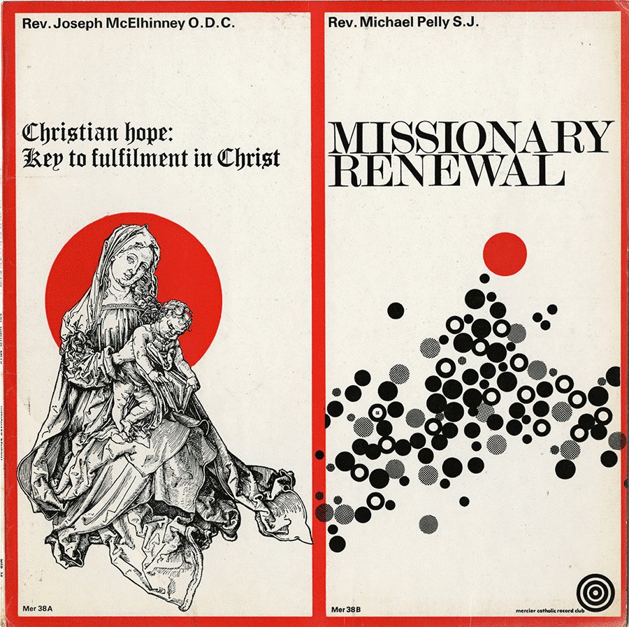
The Mercier records typically featured two recordings by separate speakers, which created an opportunity for complimentary or even narrative pairings of illustrations. This allowed for a creative play on imagery which is particularly evident in Klaasen’s first sleeve design of the series (fig. 6). The sleeve for this 1967 record quite implicitly presents us with a visualisation of transition, from traditional iconography to contemporary geometric graphics. The image on the left features a line rendered Madonna and child, in a style reminiscent of 16th-century engraving. On the right, an echoed form is reduced to a black and white cloud of circles, with the red colouring of the Madonna’s halo remaining as the sole symbol to denote its religious undertone. This transformation in representation is reflected in the title typeface, which dramatically changes from a gothic blackletter to a Modern serif, that still harkens to a traditional form while appearing strikingly contemporary in contrast to the former. It is on this cover we find the first rendition of a modernist Catholic Record Club logo, that offers parallels to the more traditional Celtic spiral ornamentation that featured on the earlier cover layout (fig. 7 and 8). On the reverse, we find a refined version, five concentric black circles, surrounding a lowercase ‘m’, an abstract representation of a vinyl record, denoting this series to be part of a contemporary vinyl market.
The title “Missionary Renewal” announces how this publication speaks directly to the changes that became synonymous with the post-Vatican II church. This self-reflective tone is expressed throughout much of the sleeve designs of the collection.
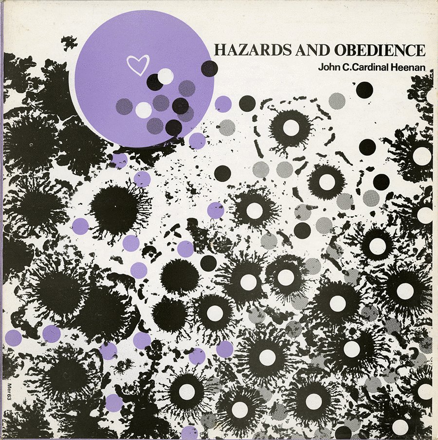
For the sleeve titled “Hazards and Obedience” (fig. 9), the circle/halo motif is again adopted, this time within a composition that seems to suggest a narrative of struggle and resolve. The illustration, though busy in tone, is muted by its simple choice of colours and the limitation of graphic forms, a chaotic composition with a modernist, subdued treatment, that speaks to the conflict within the title. The cover’s composition is comprised of three main graphic elements; A circle, with an associated heart symbol and a black cell-like shape. The layout can be read with a distinct separation, made evident by the shift in colour of the circles, from purple to grey and the changing cell motif. Although this cover features a single image, there is an implied grid in this change in imagery, creating narrative and movement across the piece. Klaasen abandons the use of any obliquely devotional imagery, save for the interpretation of the circles as representative of the recurrent halo or holy light and the use of the colour purple, often attributed to Easter. The image is dominated by the cell imagery, which may be perceived as the “hazard” of the title. The text description on the sleeve’s reverse suggests this hazard is a loss of a past and an uncertain future. “Has the day of religious and priests passed”, asks John C. Cardinal Heenan, with obedience presented as the answer to this challenge. In the composition, the interactions between the two elements become a symbiosis, with the halo overlaying the cell to create a new motif, a composite of the two. This could be inferred as an inoculation of the “hazard” or a form of synergy. It is representative that whatever concerns the Church perceived of a modern world, they had resolved to meet and coexist with them.
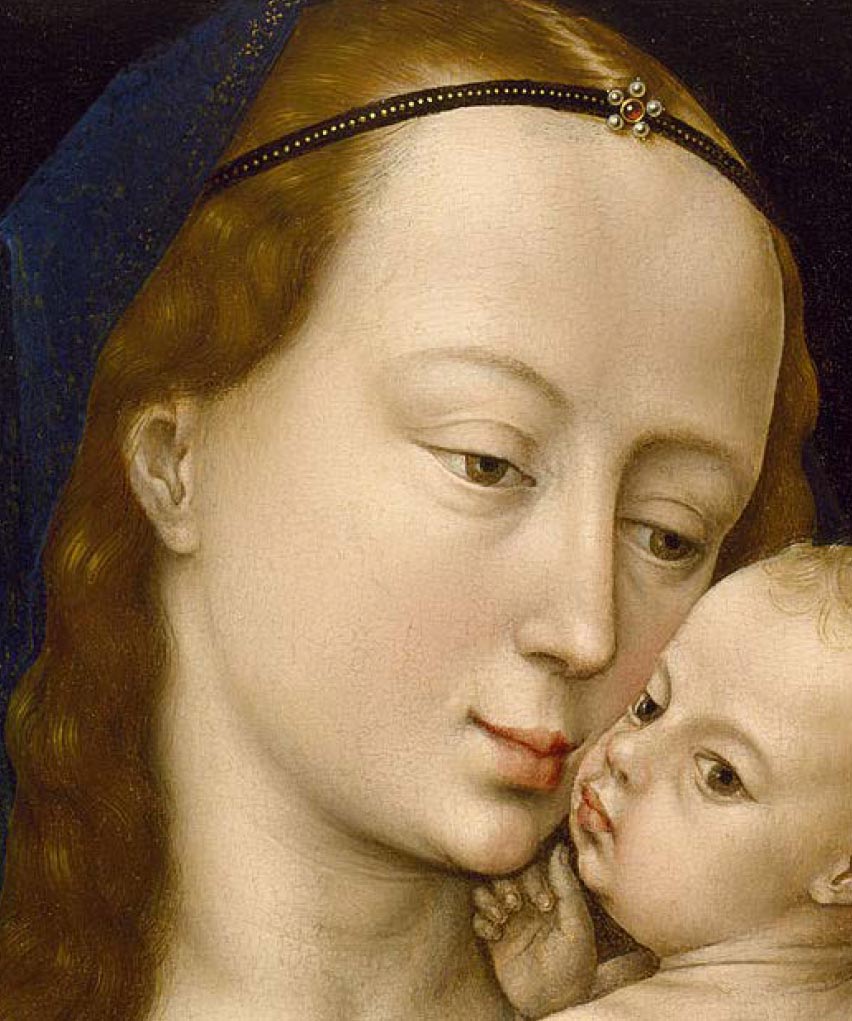
This nontraditional interpretation of the subject matter was concurrent with the period and expressed the more unconventional approach to spiritual publications that Mercier Press had long been known for. However, this form was not universally appreciated. The records themselves were criticised by Archbishop John Charles McQuiad for allegedly not having passed his censors[12]. In response to criticism regarding a poster design, Cor Klaasen makes an impassioned appeal in a 1972 letter to a Father Fox, towards the use of modernist design in religious media and the role of the artist in the church's re-imagining of itself. He makes a case for the modernisation of visual language in reference to the church’s long tradition in the employ of artists to produce imagery in line with contemporary conventions. Referencing paintings from the middle ages and citing the portrayal of the Madonna, such as that in the paintings of Lucas Cranach the Elder, he points to the addition of customs prevailing at the time; “Madonnas with their foreheads appearing bulbous and strange because it was the fashion of those days to shave part of the hair. Look at the naked eyelids. The fashion again.”[13]. These examples, he continues, act as a means of “referring to the period in which the paintings or sculptures are made”, suggesting the role of artist as mediator between the church and contemporary culture.
“Madonnas with their foreheads appearing bulbous and strange because it was the fashion of those days to shave part of the hair. Look at the naked eyelids. The fashion again.” (Klaasen, on the historical role of artists in re-imagining the image of the Church)
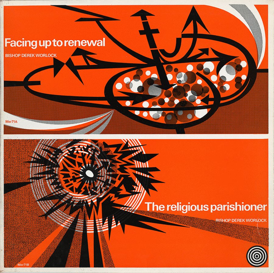
An aspect of the new identity the Vatican wished to advance was that of a more temperate, introspective church. In a piece for “Facing Up to Renewal” (fig. 11), the halo motif is seen to be beset by a chaotic series of geometric lines and shapes. Again, with this cover, we find a lack of imagery typically identifiable as religious. A single cross appears amidst a swirl of arrows, appearing to suggest that even the church may not know what direction they are heading. The halo motif reappears, an effervescent bubbling contained within the lines of the arrows, while in the following panel we see a graphic treatment of movement, with arrows, radial lines, concentric circles and explosive expressions, that radiate out of frame. The accompanying text reflects on the church’s struggle to understand society’s “rapid and continuous change” and for its parishioners to “adapt the spirit of their foundation”[14]. Like many of the illustrations in this series, they seem to speak not so much to the resolve of the post-Vatican II church, but of the internal, turbulent situation this period presented to the clergy and its parishioners. The overall aesthetic of the design is more akin to that of jazz record sleeves of the period[15]. It presents an energy and vibrancy of colour that reframes the turbulence of the subject as a resolution of excitement and anticipation; the uncertainty of the present offering an explosive radiating movement outward to the future. In both style and theme, this connects to the efforts of contemporaries within the design community whose work aimed to counter the narrative of a conservative Ireland of the time[16]. “In a few years time it will be said that Ireland knew how to go about attracting new vocations,” Klaasen states, sharing the ideals of a new outward-looking, modern Ireland[17].
Klaasen’s work on the Catholic Record Club series serves as a re-framing of the vocations standing towards a modern audience. This role was explored further within the world of Irish design, helping to create ‘an age of stark contradiction and contrasting styles’, as Richard Hurley suggests[18]. This was being manifested through a fluctuating image of the Church and a newly modernising Ireland. It is worth noting that the Second Vatican Council had a significant impact on media publication beyond the church’s visualisations[19] and Klaasen’s impact on Irish design can be considered more significant in relation to his design for educational book covers or his later work as an educator. However, often referring directly to the challenge the Catholic Church and its parishioners were facing at the time, this series offers a brief glimpse into a church looking inward, presenting imaginings of the struggles of its re-identification. Much like his contemporaries in the tourist industry offered an outsiders view of a changing nation’s identity, Klaasen presents the depiction of a tradition in flux. His Mercier Record covers offer a unique look into the pictorial expression of an institution within this transition, presenting a church that was dynamic, self-effacing and hopeful.
[1] King, Linda. “(De)constructing the Tourist Gaze: Dutch Influences and Aer Lingus Tourism Posters, 1950-1960”, Ireland, Design and Visual Culture: Negotiating Modernity, 1922 - 1992, edited by Linda King and Elaine Sisson. Cork: Cork University Press, 2011. 166-187.
[2] Turpin, John. “The Irish Design Reform Movement of the 1960s.” Design Issues 3, no. 1 (1986): 4-21. Accessed May 5, 2020. doi:10.2307/1571637.
[3] de Cléir, Síle. “Historical Background.” In Popular Catholicism in 20th-Century Ireland: Locality, Identity and Culture, 1–16. London: Bloomsbury Academic, 2017. Accessed May 4, 2020.
[4] Fay, Terence J. “Changing Image of Irish Spirituality: The Irish Messenger of the Sacred Heart, 1888-1988.”
[5] Ellen Rowley, Carpenter, Andrew, Rolf Loeber, Hugh Campbell, Livia Hurley, John Montague, eds. Art and Architecture of Ireland Volume IV: Architecture 1600-2000. Royal Irish Academy, 2015.
[6] Kostick, Conor & Farmar, Tony. The History of Irish Book Publishing. 2018.
[7] John Spillane, “Interpreting the Irish to themselves: The Mercier Press Looks Back on Fifty Years of Publishing.”, Books Ireland 177. Wordwell Ltd. 1994: 116-17
[8] Tony Farmar, Conor Kostick ed . The History of Irish Book Publishing. THP Ireland, 2018, chapter 6 .
[9] Hutton, Clare. and Walsh Patrick (Ed.) The Oxford History of the Irish Book, Volume V: The Irish Book in English, 1891–2000 OUP Oxford, 2011.
[10] McCormack, Niall. Cor Klaasen: Jackets, Covers and Sleeves. 2010.
[11] Work by Niall McCormack, NIVAL and the Klaasen estate have helped ensure the continued recognition of Klaasen's book design and educational work. The majority of Klaasen's commercial output, in advertising ephemera and exhibition stand design work, is largely lost. "Slides and photos of the exhibition stand work are available in the archive at NIVAL, as well as a handful of examples of advertising ephemera from the late 1950s or perhaps the early 1960s". Klaasen, Ben. 'Cor Klaasen essay'. Email, 2021.
[12] Kostick, Conor & Farmar, Tony. (2018). The History of Irish Book Publishing.
[13] Letter from Cor Klaasen to Father Fox, 1st November, 1972. NIVAL, courtesy of Ben Klaasen
[14] Text description on the reverse of MER 71 “Facing Up to Renewal”. Source, NIVAL
[15] Similarities can be seen in Klaasen’s repeated use of circle to that of Josef Albers work with Common Records. Steven Heller, “When Bauhaus Met Lounge Music”, 2015. According to family sources, Klaasen was a fan of post-bop and west coast "cool jazz".
[16] King, Linda, and Elaine Sisson. “Visual Shrapnel: Rethinking Irish Studies through Design and Popular Visual Culture.” The Canadian Journal of Irish Studies 38, no. 1/2 (2014): 56-83. Accessed May 2, 2020. www.jstor.org/stable/43410724., p69
[17] Letter from Cor Klaasen to Father Fox, 1st November, 1972. Courtesy of Ben Klaasen
[18] Richard Hurley quoted in Ellen Rowley, Art and Architecture of Ireland Volume IV, 298
[19] Mac Carthaigh, Lir. Vintage Values: Classic Pamphlet Cover Design from Twentieth-century Ireland. Veritas Publications, 2013.
Images of The Catholic Record Club record sleeves sourced from NIVAL. http://www.nival.ie/collections/collection/archive/cor-klaasen/view/collection.
Fig. 1. Dispersion of the Fathers Second Vatican Council by Lothar Wolleh (1930–1979). Source: https://commons.wikimedia.org/wiki/File:Second_Vatican_Council_by_Lothar_Wolleh_004.jpg
Fig. 2. Source: Off The Record. http://www.offtherecord.ie
Fig. 3. Cor Klaasen. Source, Ben Klaasen.
Fig. 4 Off The Record. Accessed May 5, 2020. http://www. offtherecord.ie/index.php?main_page=index&cPath=180_402.
Fig. 5. Marber Grid. Source: Accessed May 3, 2020. http://penguincoverdesign.com/2020/04/04/r-i-p-romek-marber/
Fig. 10. Rogier van der Weyden, The Virgin and Child, 1455. Source: Museum of Fine Arts Houston. https://www.mfah.org/

