Modular System
How can modular systems adapt to the promotion of ideas and products in different scenarios?
Nowadays, production and consumption are growing more popular each day. This increase brings more competition and therefore, there is a need to innovate and find new ways of advertising. As a response to market competition, pop-up shops became a tool to stand out in front of other stores. This new shopping model is becoming more popular these days, and it’s an international trend. In this project, I show structures that can attend to pop-up shops, offices, charity shops, and even residential use.
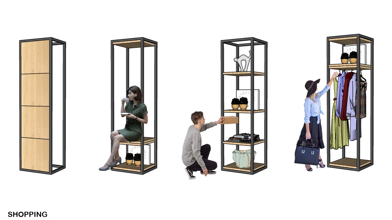
The idea of this structure is to move all the shelves according to the use. Time the structure would just look like a plain panel and time it would be transformed into a seat, shelves or a bench.
The idea of shelving structures was also to
put them together side by side and create a wall.
The aesthetics of multiples structures 01 together did not look as expected and created a vertical repetition that was not pleasant and looked repetitive.
Starting from this, a new idea came up. Stretching structure 01 to 100cm, instead of 50cm, and adding circular colorful shapes to its background panels, giving it more movements, more color, and consequently it gave other possibilities to create new ways of use. Structure 02 can be combined together to structure 01, creating many combinations of the two together.
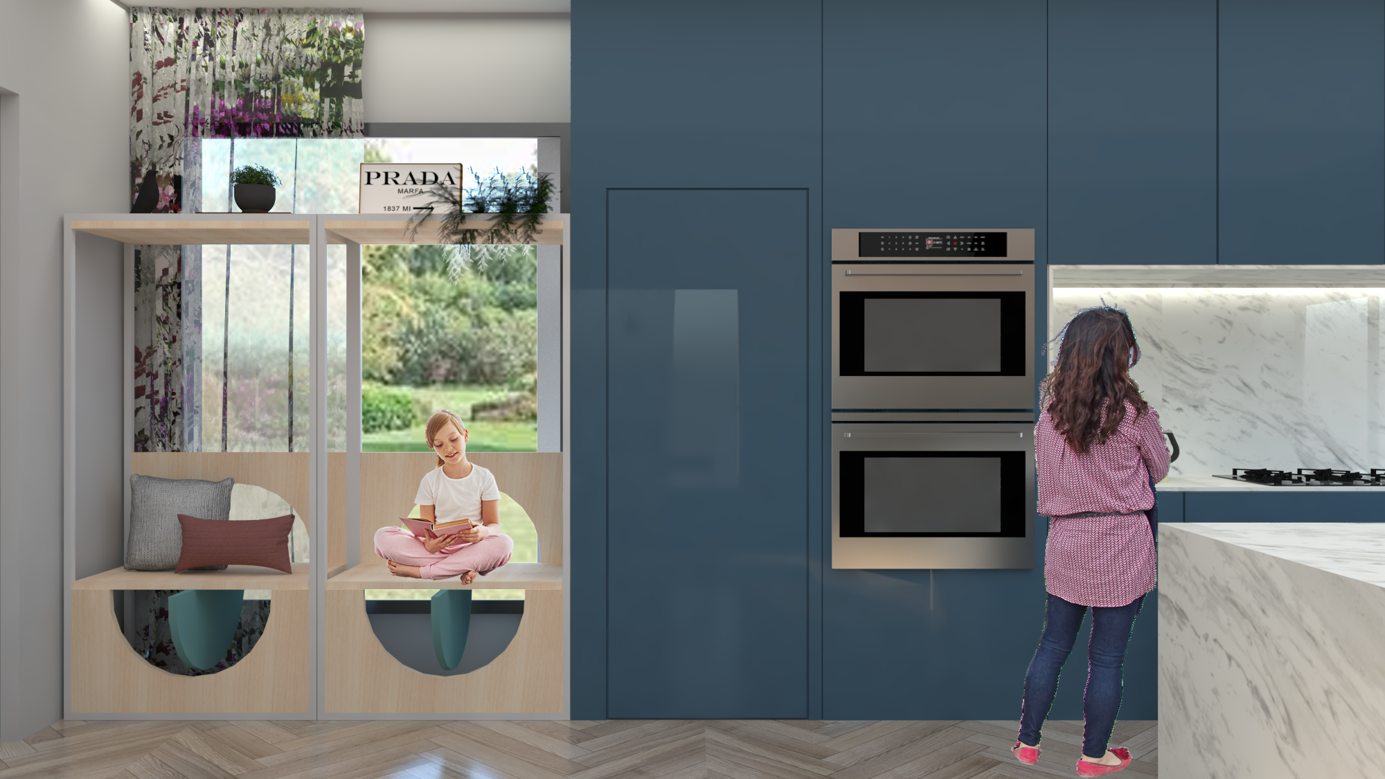
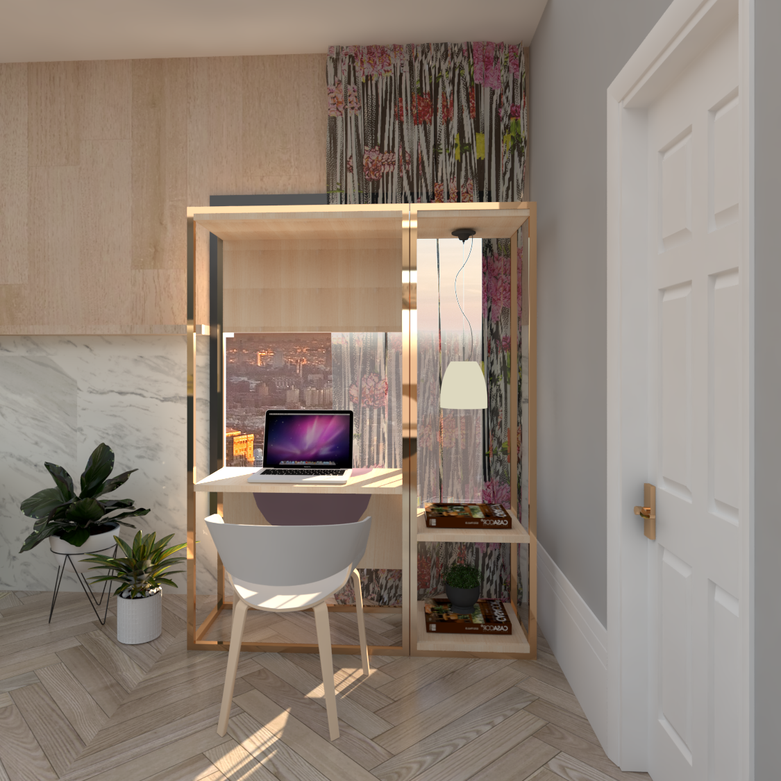
This new structure has more almost the same uses as structure 01, but it also became a desk and a bigger seat.
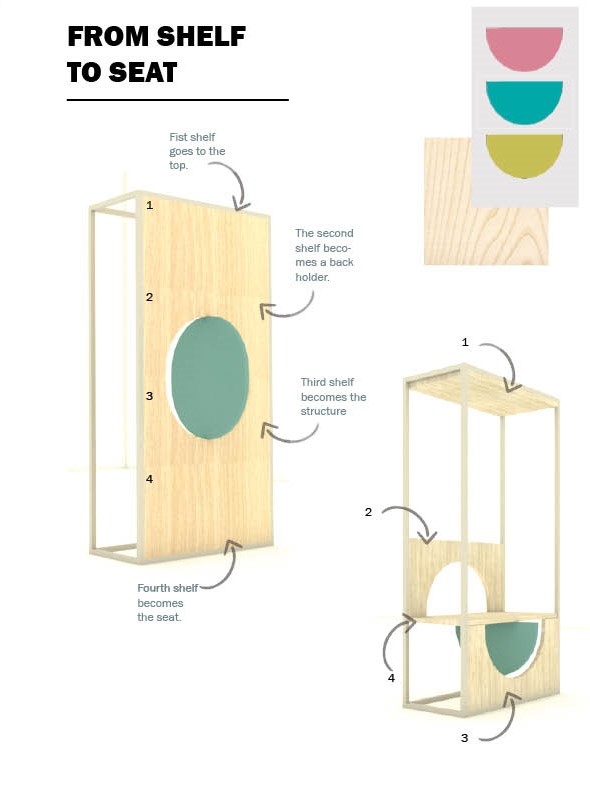
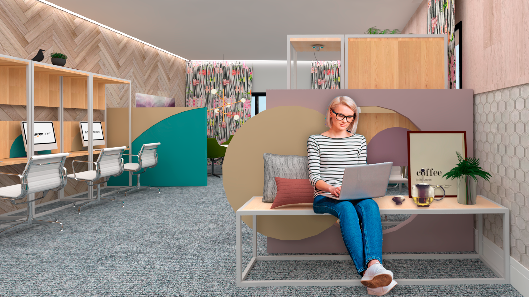
The seat structure is one of the variations if this new structure. Moving the wooden panel is possible to transform it into a seat. The idea is that the structure can easily be changed by the user whenever necessary.
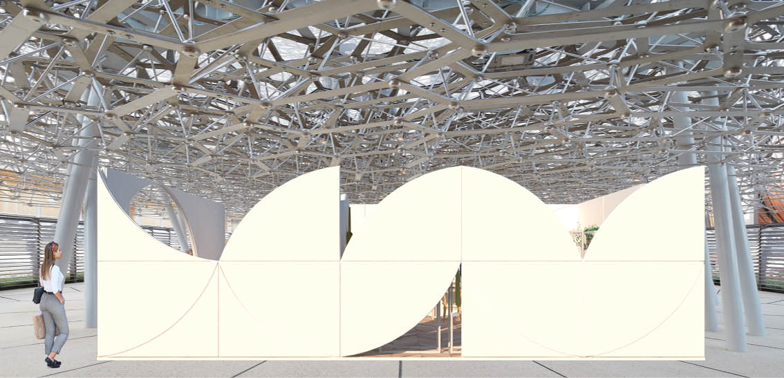
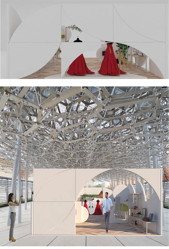
Concept one was the first attempt to put the shapes together in an actual environment, putting as whole all the structures. I choose a clothes store as scenario as I had this pop-up idea and a clothes store seemed something that we all have seen and were easy to stop the main needs. At first, the idea of foldable walls, floor, and the ceiling was very strong, and the previous shapes created were being used only as half walls, and a type of background to sofa and shop front.
On the figure below is possible to identify the same elements in both floor plans, but one is the compact version and the other one is the extended version. The initial idea was this transformation of space, adapting the use, smaller or bigger, according to user needs, trying always to keep the same elements.
None of the structures have to follow a way of use, the idea of freedom of the use is something that I tried to keep during my creative process.
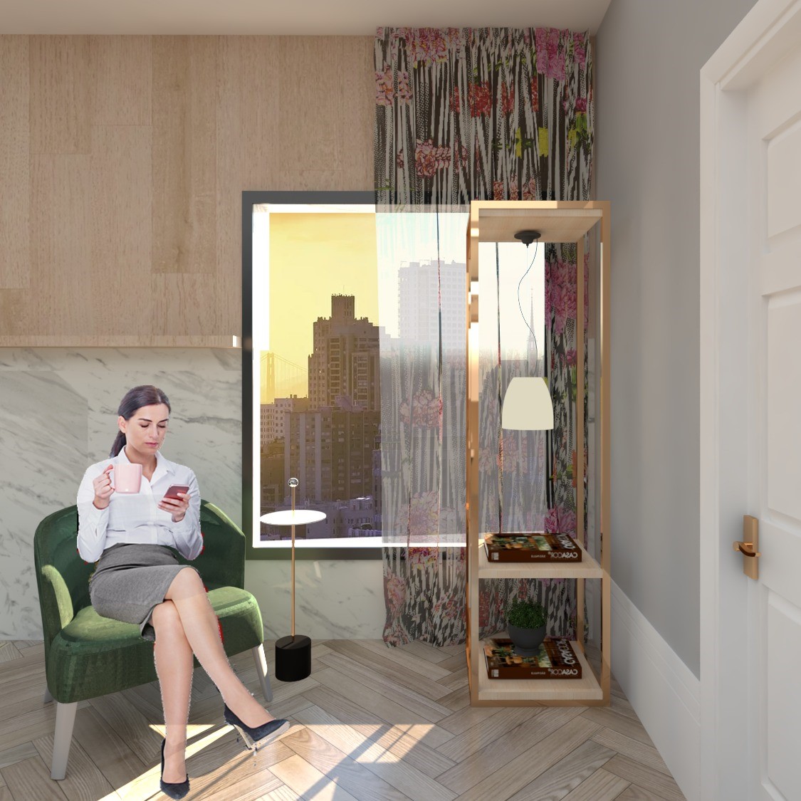
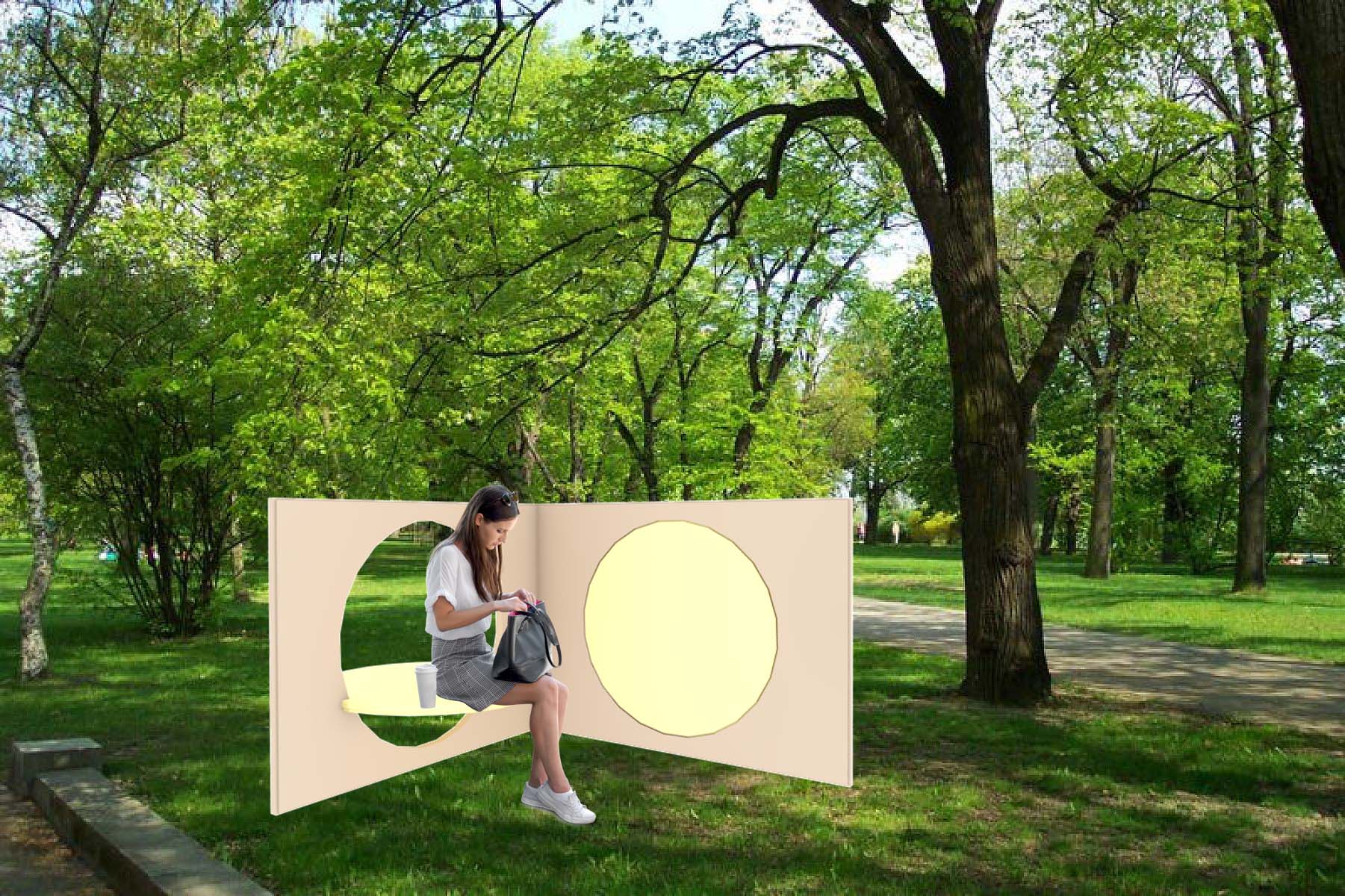
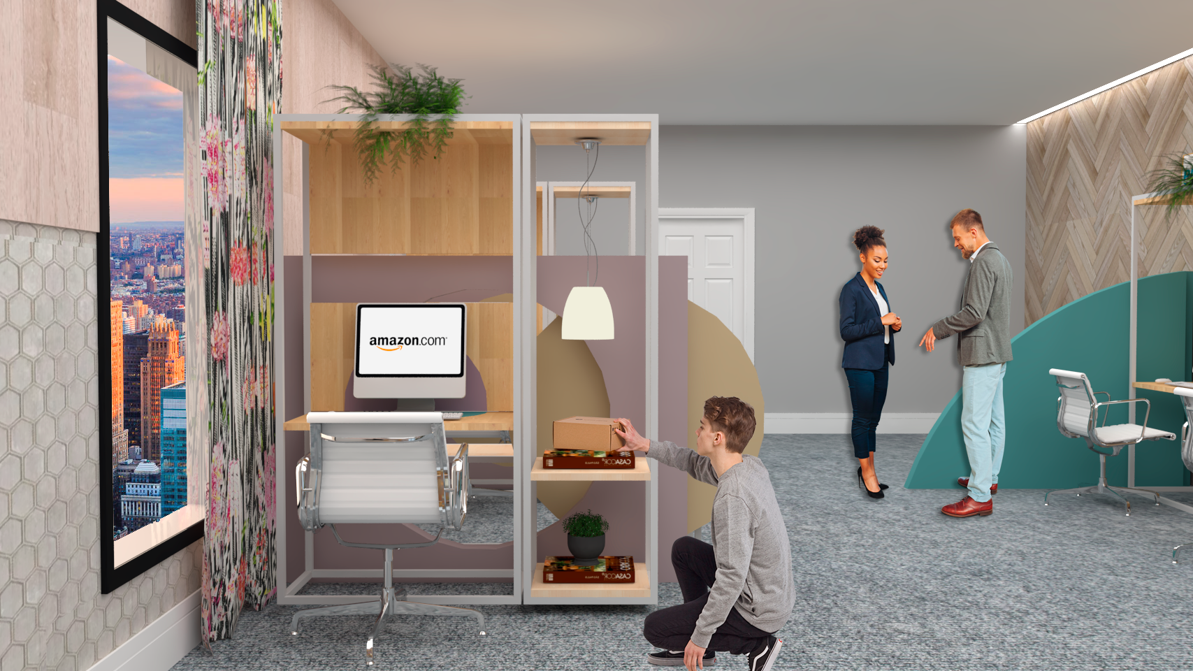
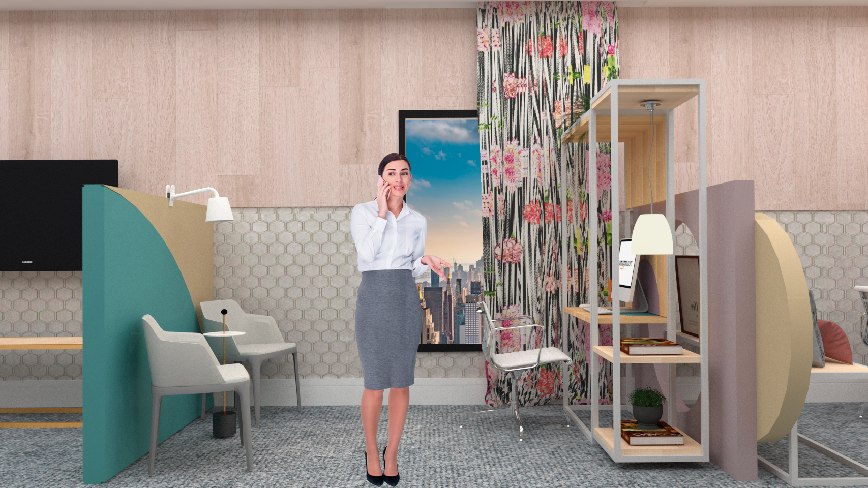
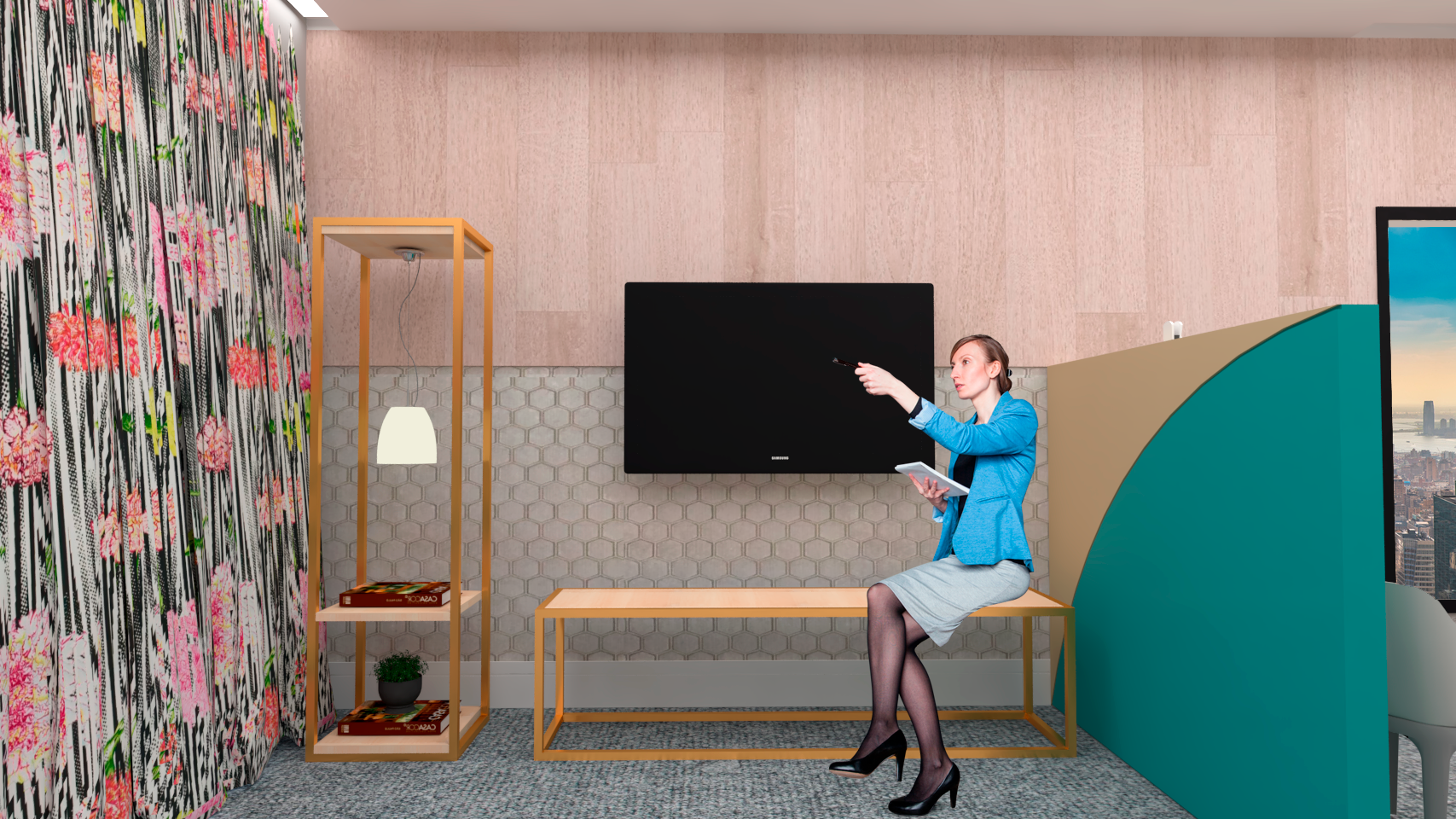
The images below show the different uses the structure can assume in the same place.
Half wall Structure:
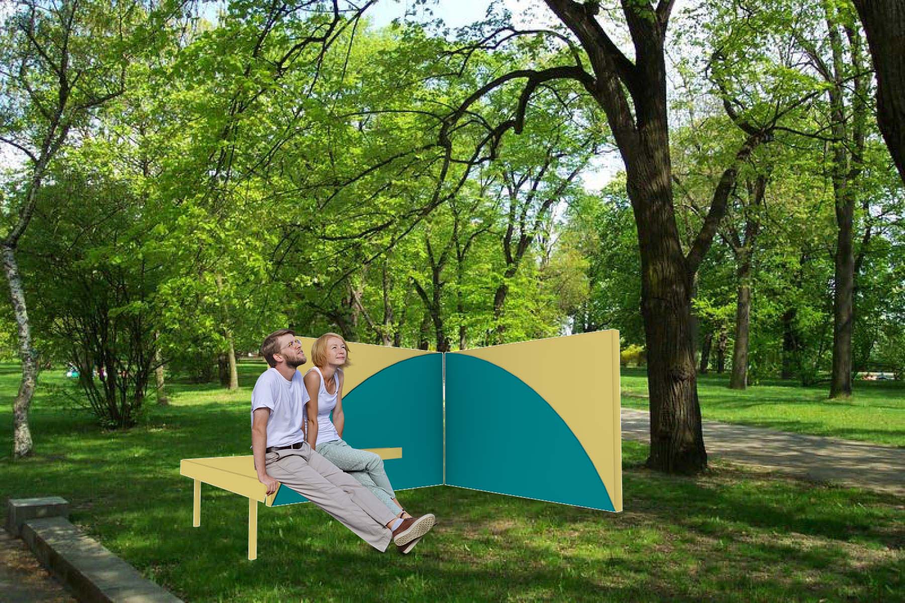
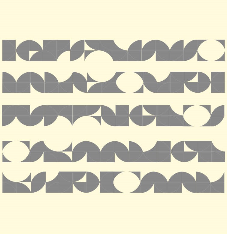
This image represents façade variations using the blue and yellow structure. The pattern uses the structures together creating different forms. Looking at this picture is possible to see how many possibilities this structure gives when put them together.
The façade self-support system uses a plywood structure, having a different look every time the geometric forms change place.
Easy to assemble, this modular system gives freedom to change the way is displayed to best suit the location that is going to be used, it also creates an interaction between the system and the user.
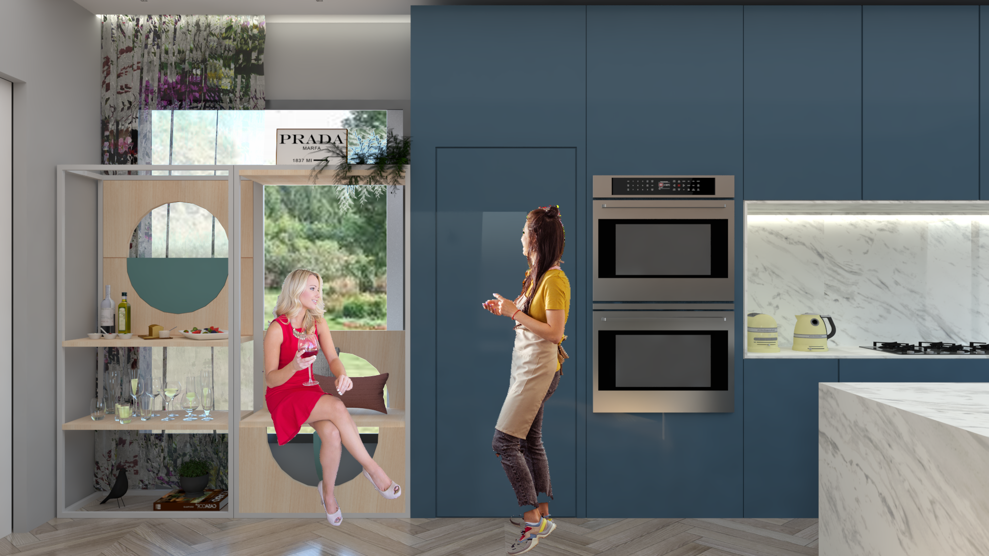
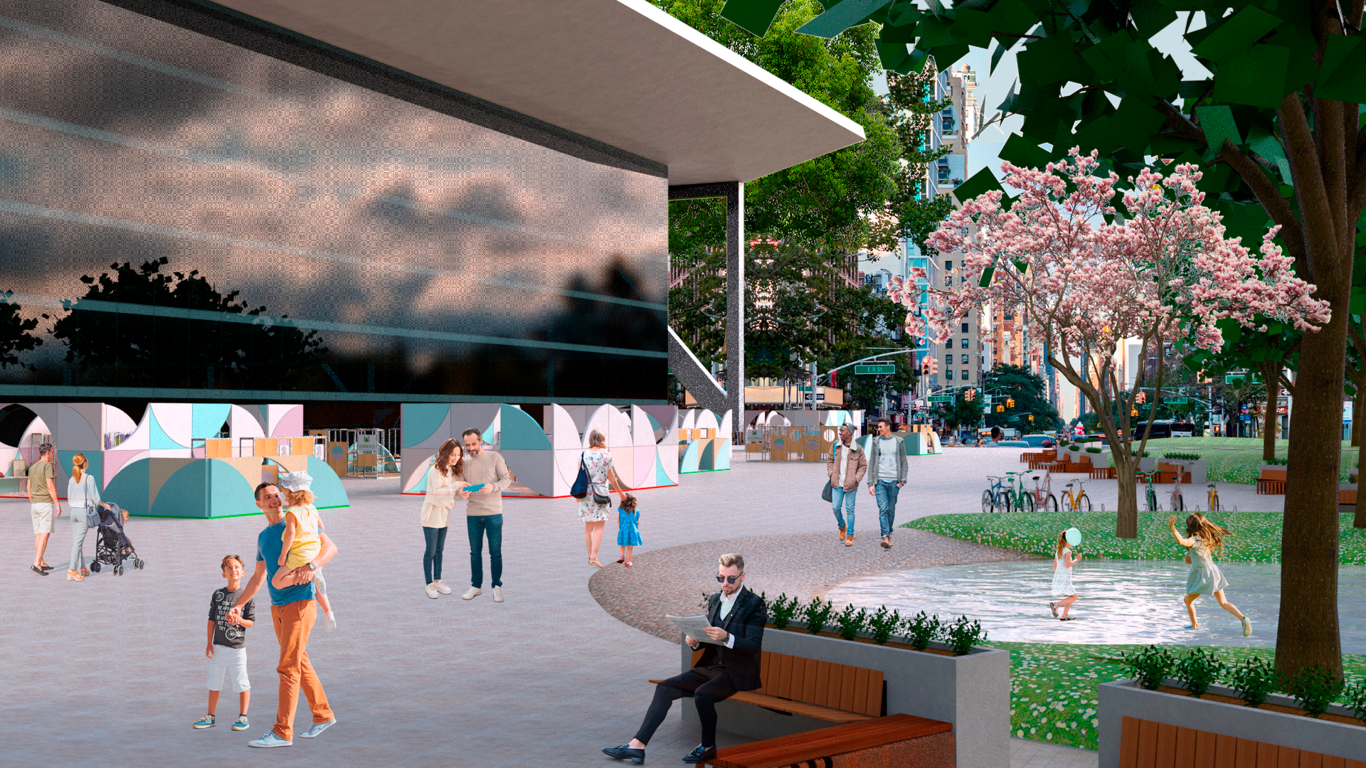
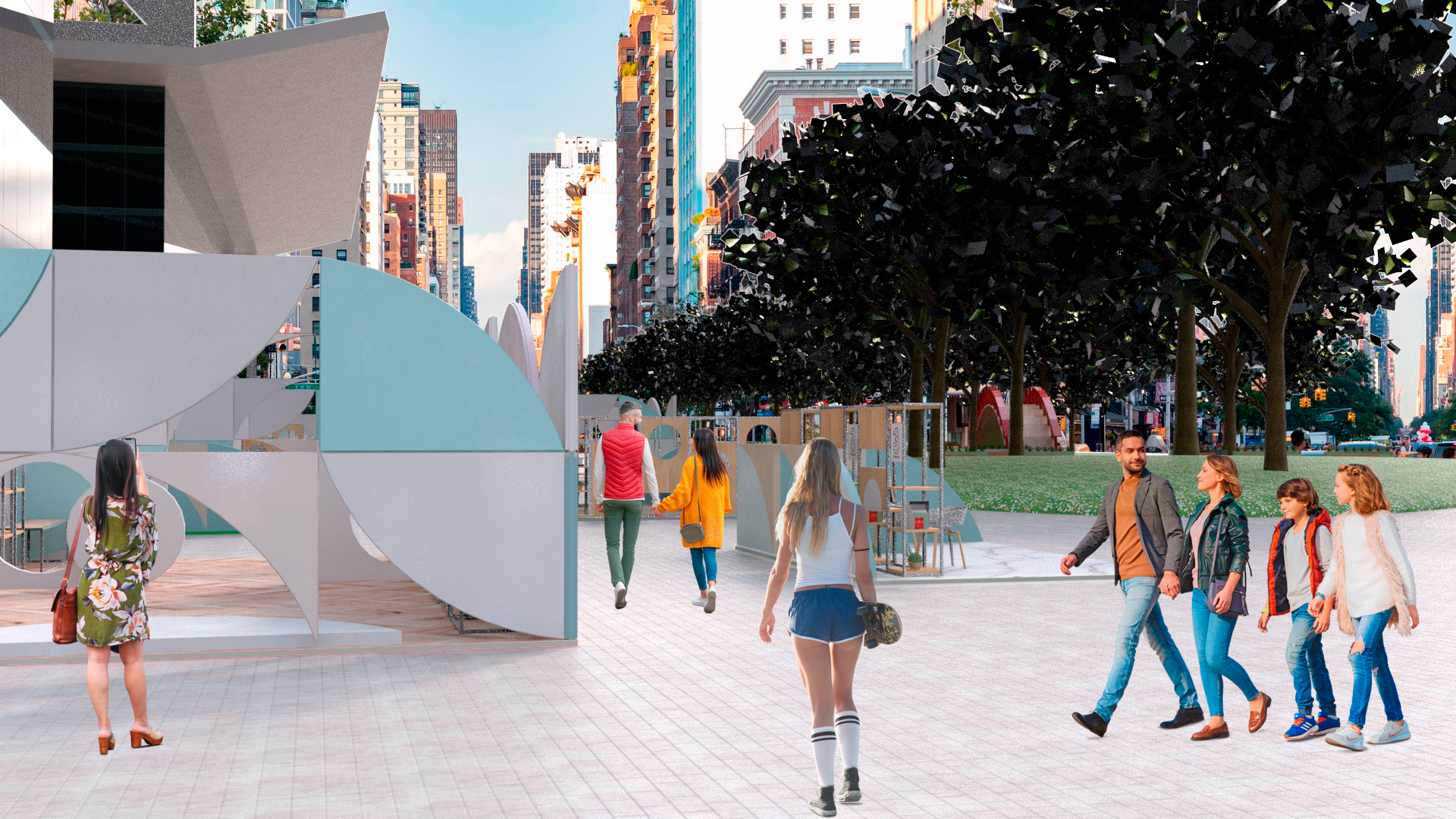
The following images show the versatility of the structures and how they work together in different scenarios.
